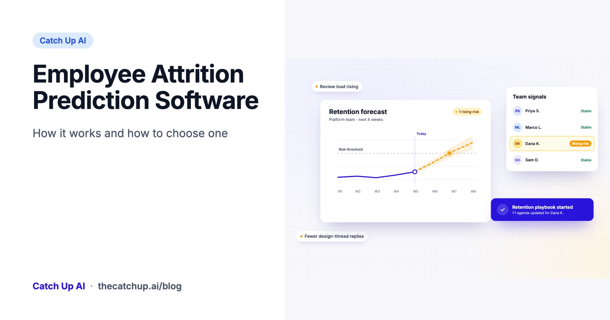
Employee Attrition Prediction Software: How It Works and How to Choose One
Learn how employee attrition prediction software works and compare 8 buying criteria, from data quality and accuracy to privacy and retention workflows.
October 23, 2026
Build an Azure DevOps sprint health dashboard that makes scope, flow, blockers, and delivery risk visible without turning reporting into manual work.

An Azure DevOps sprint health dashboard should help a team make a better decision this week, not create a polished status page that everyone reads after it is too late. The most useful version brings together sprint commitment, scope change, active-work age, blockers, flow, and a clear owner for each material risk.
The goal is not to replace Azure DevOps dashboards or make every team use the same template. It is to standardize the questions leaders ask while preserving the context each team needs.
At Catch Up AI, this is the standard for useful delivery intelligence: a dashboard should reduce the time between seeing a risk and assigning the next action.
A good dashboard answers these questions in under two minutes:
| Question | Evidence to show | Why it matters |
|---|---|---|
| Are we on track to meet the sprint goal? | Committed versus completed work, remaining work, sprint goal | Keeps the conversation on the outcome, not activity |
| Did the sprint change after it began? | Items added, removed, or materially resized | Makes trade-offs explicit |
| Where is work getting stuck? | Time in state, work-item age, WIP by stage | Reveals workflow bottlenecks before the end of the sprint |
| What needs attention now? | Blocked items, dependencies, aging high-priority work | Creates an actionable risk list |
| What should we learn next time? | Carryover and repeated reasons for delay | Improves planning and system design |
Microsoft’s native Azure DevOps widgets already make velocity, sprint burndown, cumulative flow, lead time, and cycle time available. Use those as your evidence layer. Your sprint-health dashboard adds prioritization: it should make exceptions and next actions easy to see.
Put the sprint goal first, followed by the work committed when the sprint began. If the dashboard starts with a big completion percentage, teams can optimize for closing small items instead of delivering the intended outcome.
Show completion in context: completed, active, not started, and removed work. Where estimation practices are consistent, you can show points; where they are not, a count of parent work items may be clearer.
Include a small list of items added after the sprint start and items removed or moved out. Scope change is not automatically a failure. Incidents and urgent customer needs happen. The risk appears when change is invisible and the original commitment is still reported as if nothing moved.
For each material addition, label the reason: production incident, executive request, dependency, defect, or planned correction. That turns “the sprint slipped” into a useful operational record.
Use your board columns to show where work is accumulating. A growing queue in code review, test, approval, or product discovery is often more actionable than an aggregate completion chart. Add a WIP view and the median age of active work by stage.
Avoid treating time in state as a target by itself. The question is not “why did this ticket spend four days in review?” It is “what in our review system made important work wait?”
Flag work items that have been active longer than a threshold appropriate for their type and size. Do not choose one universal number. A two-day-old production bug and a two-week feature discovery item are different kinds of work.
The dashboard should show the item, its current state, owner, last meaningful update, linked blocker or dependency, and suggested question. A list of 30 red items is not useful; prioritize the small set that can affect the sprint goal or release.
Make blocked work easy to find. In Azure DevOps, teams often use a tag, custom field, link type, or board convention. Choose one and use it consistently. Then require a blocker owner and expected resolution date for any blocker that threatens the sprint.
Dependencies should sit beside blockers, not in an untouched planning file. A work item waiting on another team or a decision is a delivery risk even when it is not technically marked as blocked.
This is the section most dashboards omit. For each risk, include the decision, owner, date, and current status. A dashboard earns its place only when it reduces the gap between seeing a signal and completing the next step.

If a delivery manager must rebuild the same queries and slide every week, the dashboard will eventually be abandoned. Automate recurring evidence and reserve human time for interpretation.
Catch Up AI's solution for engineering leaders addresses this gap by connecting delivery signals with clearer priorities and next steps. It is not another velocity chart. It helps teams ask which risk deserves leadership action before the next status meeting.
Include the sprint goal, commitment versus completion, scope added or removed, active-work age, bottlenecks by stage, blockers, dependencies, and an action log. Keep it limited to signals that can change a decision.
Create a shared convention, such as a tag, custom field, or state, for blocked work, then build a query and chart from it. More importantly, add an owner, reason, and expected resolution for each material blocker.
No. Sprint-health reporting should evaluate the team’s work system and delivery risk. Individual activity counts are easy to misread and create incentives that harm collaboration.
Use this sprint-health dashboard with the Azure DevOps delivery metrics guide to establish a weekly review. Then give delivery leaders an easy way to investigate the exceptions. Install the free Catch Up Azure DevOps extension to see how delivery signals can become a concrete next action.
Continue reading more insights from CatchUp AI