
How to Measure Cycle Time per Workflow State in Azure DevOps
Learn how to measure Azure DevOps cycle time per workflow state, identify bottlenecks with cumulative flow, and find where delivery work actually waits.
September 24, 2026
A practical guide to building an employee retention dashboard that helps HR and managers see early risk, understand context, and act before turnover happens.
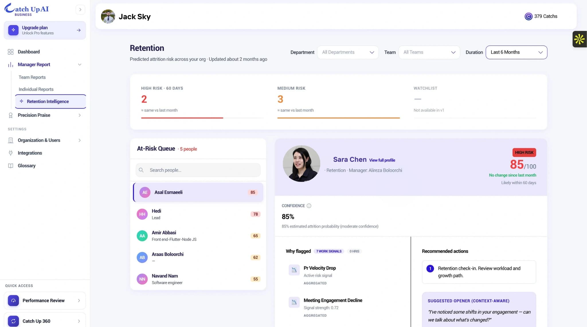
Most employee retention dashboards are built to explain what already happened. They show turnover rate, regrettable loss, headcount change, exit interview themes, and sometimes engagement scores by department. Those metrics matter, but they arrive late. By the time turnover shows up on a dashboard, the employee has already left, the manager is already backfilling, and HR is already trying to explain the pattern in hindsight.
A better retention dashboard helps teams see what is changing while there is still time to act. That is where Catch Up AI can fit into the workflow: not as another report for leaders to admire, but as a way to connect people data, work signals, and manager follow-up into one clearer operating view.
A useful dashboard should not start with every possible metric. It should start with the questions HR and managers need to answer each week.
The most important questions are simple. Which teams are showing early signs of strain? Where are managers losing connection with employees? Which employees have seen a meaningful change in recognition, workload, collaboration, or growth visibility? Where is risk visible, but no one owns the next step?
This is different from a dashboard that only shows turnover rate by month. A retention dashboard should be forward-looking enough to guide a conversation, but careful enough not to treat people as predictions.
Start with stable HR metrics. Role, tenure, manager, team, location, recent promotion history, internal mobility, compensation band movement, and manager changes all provide useful context. Clean HRIS data is often the first layer because it gives the dashboard a reliable organizational map.
Then add engagement context. Surveys can show whether people feel heard, supported, recognized, and able to grow. But surveys should not be treated as the full picture. Many teams have survey gaps, where sentiment looks acceptable but behavior has already shifted.
The next layer is work context. Useful dashboards look at patterns such as missed 1:1s, fewer recognition moments, collaboration friction, sudden workload changes, blocked work, or declining participation in team rituals. These workplace signals are not proof that someone is going to leave. They are context for better manager attention.
Retention dashboards can become dangerous when they make weak data look certain. A risk score without explanation can lead to overreaction, labeling, or manager anxiety. A dashboard should show drivers, confidence, and context. It should also make clear what the system does not know.
For example, a drop in meeting participation might mean disengagement. It might also mean deep focus, personal constraints, a role change, or a temporary project cycle. A good dashboard gives managers a reason to check in, not a reason to assume.
This is especially important when a dashboard surfaces possible flight risk. The right response is not to panic. It is to understand what changed, what the employee may need, and whether the manager has the context to respond well.
The biggest weakness in many HR dashboards is that they stop at visibility. They show risk, but they do not show ownership. They show a trend, but they do not clarify the next conversation. They help executives see the problem, but they do not help managers handle it.
A stronger dashboard includes an action layer. It should show whether a manager has reviewed the signal, scheduled a conversation, documented follow-up, or closed the loop with HR. This is not about surveillance. It is about making the workflow visible enough that risk does not get lost.
The best retention dashboards also make timing obvious. A manager should be able to see whether a signal is new, repeated, worsening, or improving after action. HR should be able to see whether the organization is learning from patterns, not just reacting to departures.
A clean retention dashboard can use four sections.
First, show team-level health: engagement, manager connection, recognition, workload, and collaboration patterns. Second, show employee-level context only when there is a meaningful change, not as a constant ranking. Third, show risk drivers so managers understand why attention is needed. Fourth, show follow-up status so HR can see whether the signal became action.
That structure keeps the dashboard useful without turning it into a wall of alerts.
Ask five questions. Does the dashboard show early signals, or only outcomes? Does it combine HR, survey, and work context? Does it explain why a signal matters? Does it help managers act? Does HR know whether follow-up happened?
If the answer is unclear, your team may not need another dashboard. You may need to inspect the workflow behind the dashboard.
A forecast review can help you map what your current systems already show, where risk appears, and where the handoff to managers breaks down.
An employee retention dashboard is a people analytics view that helps HR and managers track patterns connected to employee retention, such as engagement, workload, recognition, manager connection, tenure, and follow-up activity.
Continue reading more insights from CatchUp AI